BeautifulU
Case Study 4
Problem
There is a lack of applications that focus on skin care to support a range of skin care experiences. Starting from teenage age, when they are just going through puberty, to adults who may have a different focus on their skin care, like wrinkles.
My Role
User Research, Information Architecture, Wireframing, Branding, UI Design, Prototyping, Usability Testing
RESEARCH
Goal
To design, build, and generate an application that focuses on all level of skin care experiences and ages. I will ensure to collaborate with dermatologist and products manager to provide the correct information for users on products and FAQ.
Methedology
To better understand the user process and needs in an educational and user-friendly experience, I conducted the following 3 data collections with five different users from different levels of experience in their skin care journey. Most of them were from different parts of Minnesota, they were all of different ages to capture the different skin experiences throughout the life cycle:
Comparative Analysis - to see how users are using the skin care service in person.
User Interviews - to hear from users firsthand their stories of how they use the skin care service and what role it plays in their skin care journey. These can be part of, or in place of, contextual interviews depending on circumstances.
Surveys - to get more objective answers.
Affinity Map
Comparative Analysis
After analyzing and evaluating my affinity map and comparative analysis, I discovered some important user and application insights that allow me to define essential user needs. I discovered:
The importance of having skin care products with ingredients.
How to track users’ skin care journey corresponding with age and skin care focuses, i.e., acne, wrinkles, etc.
Utilizing visuals to help provide user application instructions.
DEFINE
User Persona
Following interviews with my target audience, I developed two user personas that represent the core user base. I chose to highlight one persona, Christine D., on the website, as her concerns and needs closely align with those of most users. To capture her full experience, I focused on the technical factors that both motivate and frustrate her.
IDEATE
Task Flow
After creating the wireframe, I mapped out the user’s task flow based on its existing navigation structure. This flow outlines each step of the user’s journey and helps identify potential pain points or obstacles.
User Flow
To better illustrate the user decision-making process and overall experience, I created a user flow aligned with the task flows. This helped me critically evaluate specific user interactions and uncover potential pain points or friction within the journey. Below is the user flow for Christine as she creates an account and searches for the product’s ingredients.
Low-Fidelity Wireframe
Building on the initial wireframes and task/user flows, I developed low-fidelity wireframes to begin shaping the overall design. These were grounded in earlier ideation and carefully scaled.
One key design decision was the inclusion of the rating icon on the ingredients page. This was directly informed by user insights gathered during interviews, where users expressed a strong preference for viewing the rating of the ingredients. By incorporating the rating icon, I aimed to provide more insights and incentives for users to purchase skin care products more efficiently, enhancing both usability and marketing potential.
Branding
After completing the low-fidelity, I moved my focus on bringing characteristics and identity to VenYou.
Logo Sketch
Chic and Bubbles were the keywords that came to my mind when I thought about the logo for BrightlyU. Therefore, I knew that I wanted a soft-edged logo that incorporated the two distinct letters, B and U.
Stylescape
Color Palette
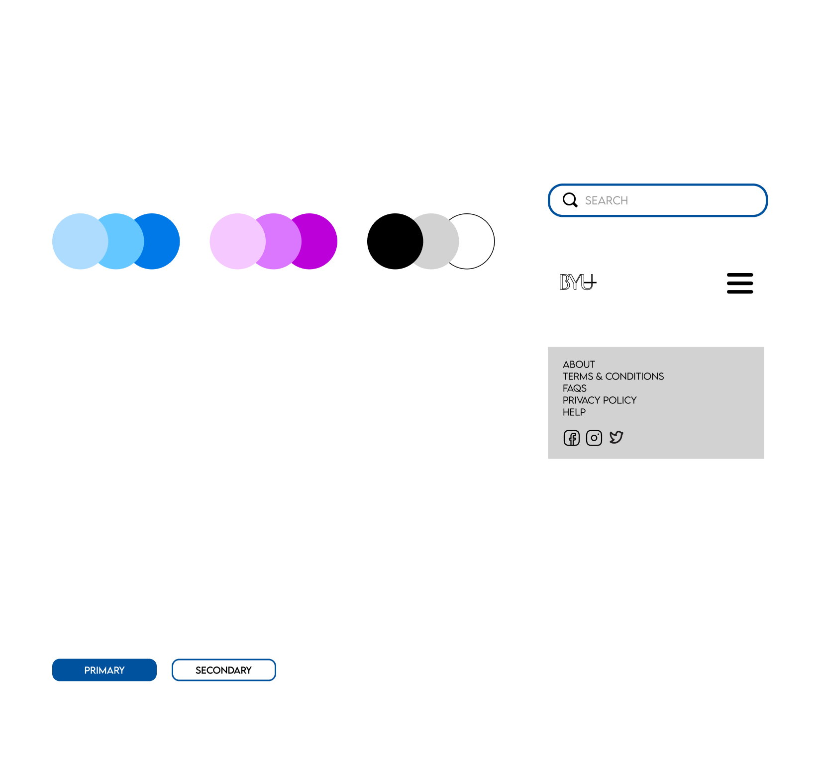
The color palette was inspired by pastel colors that will showcase the bright and fuzzy feeling of freshness and clarity. Therefore, I decided on the final primary and secondary colors option. I wanted to ensure that the neutral colors still correlated with the primary and secondary pastel colors.
By combining the logo, color palette, typography, illustrations, iconography, and textures/shapes, I created a Stylescape to define the aesthetic and emotional tone of the BrightlyU brand. When collaborating with clients, Stylescapes serve as a visual guide to communicate the app's design direction, while also opening the door for feedback and iteration to ensure the final product aligns with the client's vision.
Revisions
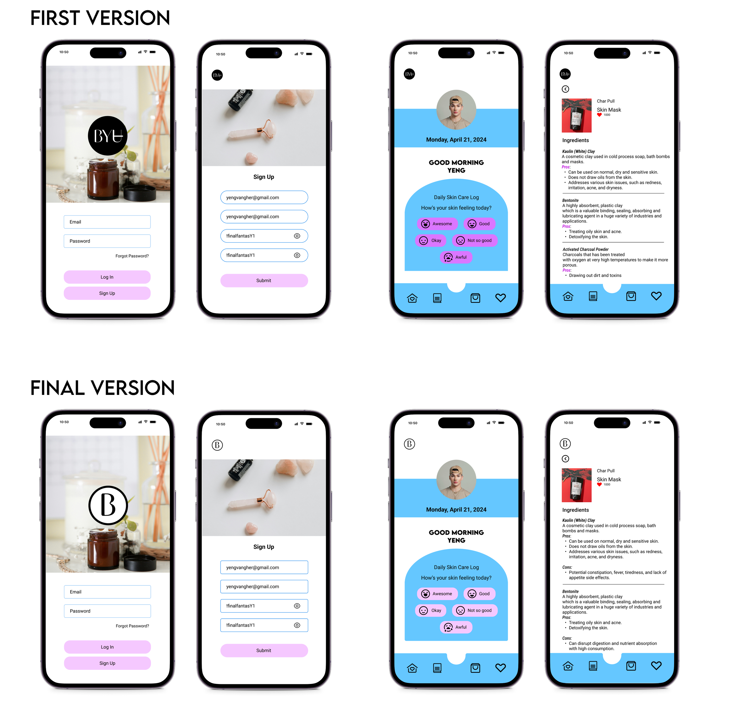
Following rounds of ideation, prototyping, and usability testing, I moved forward with the final design revision. User feedback highlighted areas of improvement—specifically, inconsistencies in the color palette that disrupted visual flow, and sharp-edged elements that clashed with the brand’s softer, rounded aesthetic. By refining these details, the final version achieved a cohesive and polished look that aligned seamlessly with the established Stylescape and brand vision.
Final Design
Outcomes
Usuabilty Test
To test the app, I recruited five participants at various stages of their skincare journey. This diverse group was intentionally selected to ensure the app is user-friendly and accessible to individuals with different levels of skincare experience. My goal was to gain insights from real users within the target audience and better understand how they interact with the product. The primary focus of the testing was to evaluate the effectiveness and clarity of the main navigation, overall aesthetics, and calls to action (CTAs).
Here are some key insights gathered from the testing:
A consistent and well-chosen color palette plays a crucial role in enhancing user engagement and overall usability.
The app’s use of rounded design elements contributes to a sense of ease and approachability.
Including pros and cons for each product ingredient improves user-friendliness and helps build trust, encouraging more informed purchasing decisions.
Providing multiple product images supports visual decision-making, allowing users, especially visual learners, to better assess and compare skincare items.
Reflection
BrightlyU was a fulfilling and impactful project that stemmed from my personal passion for skincare. Drawing from my own experiences, I designed the app with the goal of addressing the common challenges users face at different stages of their skincare journey. I aimed to create a solution that is approachable, informative, and user-friendly, particularly for younger users who may feel overwhelmed when starting out. Through thoughtful design and user-centered features, BrightlyU aspires to make skincare more accessible, effective, and empowering.
The following are some key takeaways from this project:
Cohesion is success
BeautifulU highlighted the importance of visual cohesion in supporting successful user interactions. This became especially clear during the color palette and layout revisions, where I focused on ensuring that all design elements, such as colors and rounded edges, aligned with the app’s overall aesthetic and emotional tone.


